 |
Concerning the use of electronic displays as an educational aid when teaching fundamentals of colour physics and colour perception. |
Background
In the late nineties I was involved in the so called FLIP project (Flexible Learning in Physics) and developed a number of applications of personal computers in connection with colour education. Two of them are described in separate articles. (See abstracts below!) Here follows some remarks on general aspects of the issue.
Introduction
Teaching and learning about colour involves a number of different means for the production and managing of colour. Traditionally, paints and pigments play the central role, of course. The art teacher Josef Albers, in his educational practice, as described in "Interaction of Colour", let his pupils use coloured papers to make collages, demonstrating various phenomena such as simultaneous contrast, illusion of transparency etc.
In addition to this it is rewarding to work with floodlights, spotlights and projectors, together with coloured transparencies. By help of these you can (1) study the interaction between coloured illumination and coloured materials, (2) get to know the enigmatic phenomenon of coloured shadows, (3) demonstrate subtractive as well as additive colour mixing.
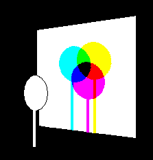 |
What is going on here? Demonstrations, as this one, give you something to ponder over and discuss. |
Quite a lot of the basic phenomena of colour vision and colour physics may however also conveniently be studied using an electronic display, such as a television or computer monitor, or a digital projector. It doesn't matter if the device is of the CRT, LCD or DLP type. They are all based on the same principle, namely that of optical (hence additive) mixing of three suitably chosen coloured lights, referred to as R, G, B.
Two different ways to use a computer display
The reader should be aware of the fact that it is two completely different things: if you use the computer display to illustrate colour phenomena, or if you use it as a means for producing colour phenomena.
Of course any colour phenomenon can be illustrated on a computer screen, as well as through colour prints in a book. In that case, what the student sees is only approximately, or symbolically, true. The legend, accompanying the picture in the book or on the screen, is not about what the reader sees, but about what he is supposed to see.
If you show e.g. a red rose on the screen, it is evident that it is only a picture of a red rose - nobody thinks it is a real red rose. But the point is, that it is also only a picture of the red of the red rose. You cannot produce such a deep, saturated, glowing, red colour on an electronic display as that of a real red rose. This fact is much more difficult for the naive observer to comprehend: that the colour I see with my eyes is not the intended colour. This seems to me to be a general problem, when using reproductive media, such as colour photography, colour print, colour video or computer displays. What you show is not what you speak about. Not only the symbolic language you use, words, icons, diagrams etc., but also the picture you show is only about the thing - it is not the thing. Quite another matter is to use the electronic display to produce or bring forth certain colour phenomena. In that case, what you see is what the discourse is about, nothing else.
Most books as well as computer programs for educational purposes, I have met, mix and confuse these two aspect. It is seldom made clear if what I see on the print or on the screen is an authentic phenomenon (i.e. should be taken seriously exactly as it appears to me) or if it is just an illustration, that has to be interpreted and modified in thought. As soon as you involve the so called standard observer, linearity assumptions and the like behind the design or the manipulation of the presentation on the screen, then it is not an authentic colour phenomenon. So the teaching of basic colour education must be kept separate from the teaching of colorimetry or theories and models of colour vision. Developing the means, you must keep in mind that there are two different ways of using a computer in connection with colour.
Principles of colour mixing
Subtractive colour mixing cannot be accomplished, only illustrated, on an electronic screen - and not even that satisfactorily, because you cannot show e.g. how a yellow and a blue filter, put together, make a saturated green. Such a green colour as that does not exist within the colour gamut of the screen.
When it comes to additive mixing, which is essentially in play whenever coloured lights are superimposed, it should be pointed out, that it is extremely common in practical situations, in the form of so called optical mixing, that is when colour patches are regarded at sufficient long relative distance not to be visible as separate units, but fuse together into a homogeneously coloured surface. This optical mixing can be conveniently demonstrated on a computer screen.
Additive mixing of coloured lights could (and should!) be demonstrated by help of three spotlights or projectors, with a red, a green and a blue filter in front. But there might be a difficulty in obtaining a sufficiently homogeneous mixture at the spot of overlapping lights, if the projectors are not of high quality. A more successful way of demonstrating the principles of additive mixing is by help of an ordinary computer display, since this is based on optical (thus in fact additive) mixing of three given primary lights: an orange-red, a yellowish green and a blue, denoted R,G,B.
 |
In fact, if you use a LCD-projector, it is just as if you had three spotlights, mounted in one and the same case. The point is that you can easily show the three spots (R, G and B) separately, then push them together to produce C,M,Y and finally let them overlap perfectly, to give one single homogeneous field on which virtually any colour hue and nuance can be produced by varying the relative intensities between the three components.
Contrast phenomena
As soon as you have a picture with two or more adjacent fields of different colours, changing the colour of one of the fields will usually change the colours of the other fields. To put it another way: The colour patches of a pattern look different when seen as parts of the whole than seen each one in isolation.
Contrast effects concern lightness values, as well as hue and saturation, and e.g. the distinctness of border between adjacent areas. There are quite a number of phenomena related to human colour vision (often misleading called "optical illusions"), that depend among other things on the kind and size (i.e. scale) of the pattern.
The changes can be small, and escape being noticed in practice, but under suitable conditions they can as well be astonishingly large. It is important for the student to be able to adjust the nuances of the coloured areas in the displayed picture so as to arrive at an optimal effect. This is something that can easily be accomplished on an electronic display, but is difficult and time consuming when working with paint, or the collage technique and a large set of coloured papers.
In addition, the contrast effects are more prominent if the areas are homogeneously coloured, without the texture that would give them a "material" character. This is typical for the so called aperture mode of appearance (a concept once introduced by the psychologist David Katz, who demonstrated and spoke about "Erscheinungsweisen der Farbe"). If you have a piece of cardboard with a hole at the centre, about 1 cm in diameter, and hold it before you, so that a part of a distant surface is seen through it, and you focus on the hole, you may see the colour of the wall sitting as a transparent film at the plane of the hole. As soon as you tilt the cardboard screen, so as to change the illumination on it, the aperture colour changes in lightness. It is very sensitive and lively. The aperture mode of appearance has also been characterized as "the aesthetic mode".
 |
It is remarkable how the look of the little grey square, having constant luminance, changes between light-grey and dark-grey, at the very moment when the background luminance passes that of the square. |
The fact that the colours on the electronic screen are luminous, not illuminated, contributes to the effect. And since their luminance can be varied freely irrespective of chromaticity it is also possible to study such perceptual effects as for instance what Ralph Evans calls the dimension of "fluorence versus greyness".
Colour scales
In making up colour scales, according to perceptual criteria, the use of a electronic screen is also convenient, because the colour nuance of each sample can be easily minutely adjusted. For instance, as an exercise, if you would construct a colour wheel with perceptually equal steps between the samples.
 The computer
program
The computer
program
Based on these considerations a program called "RGB" was developed and used at university level, in general courses on colour science, as well as for school teachers and pupils at various levels. The easiness with which one could play around with colour an arrive at distinct results was appreciated. The program contains 24 pages, each one dedicated to a specific visual phenomenon, and comes together with a book, describing what you can do and with comments on the phenomena seen. It is so far only available in Swedish, but a self-instructing English version is under production. Here follows some notes on essential principles for the design of the program.
Using the keyboard to vary the colours
The full screen is used for displaying each page. There should be no icons or virtual tools present, which would distract the purely visual task of adjusting the colour nuances. All manipulation is done via the keyboard, using rules that are rapidly learnt, as e.g. push R to increase the contribution of the red primary, G to increase the green primary, and B to increase the blue primary. To decrease the intensity, use the key beside. Numerical information about the excitation levels can be shown/not shown by pushing the Space key, and so on.
To use the mouse for the task of varying a colour would imply the temptation to split the variation into two: variation of luminance, variation of hue & saturation. This would break the symmetry between the three dimensions R,G,B, defining the colour space of the screen. And introduce some theoretical colour system, working underneath the surface, making exactly what you do less perspicuous.
Using palette-graphics for rapid, quasi-continuous colour variation
The so-called palette-graphics was invented around the same time as when a visual interface with colours was introduced i connection with computers. It is quite an ingenious idea. Each pixel is assigned a number, which refers to a look-up table (the "palette") where it is associated with a r,g,b triple. All pixels belonging to the same figure, or homogeneously coloured area of the picture, get the same number. Once the pattern is constructed, you don't need to redraw it to change the colour of a figure, or area. You just go to the corresponding entry in the palette an change the r,g,b -values there. And the whole figure, or area, immediately changes its colour correspondingly (immediately being almost = refresh rate of the screen).
With the original VGA-graphics, this was only possible with 320x200 pixel areas and 256 different colour numbers. With the advent of SuperVGA the method was generalised to higher resolutions and standardized by VESA. Most graphic cards nowadays have VESA bios VBE3, which includes the facility to use 16 million colours in the palette (24 bit DAC), making possible very fine adjustment of each one of the 256 colours.
Observe that you may have the whole screen visually at one and the same colour, but still keep the pattern, since it is defined by the colour numbers (names, if you like). By pushing a key the pattern is "developed" ...
The efficiency is evident: Say that you want to change the colour of a square of 100x100 pixels. If this square has been assigned colour number 4, you go to palette entry 4 and change the r,g,b values there. The alternative in 24-bits graphics, would be to redraw the square and put the new r,g,b-triple at each pixel, i.e. changing it at 10000 places (instead of one!)
This is the reason why the speed of varying the colour of figures on the screen is: (1) independent of resolution; being the same at 640x480 as at 1280x1024. (2) independent of CPU speed; being almost the same with an old 486 as with a modern PC.
You can accomplish the same with alternative techniques of parallel processing, used in modern graphics cards, using 32 or 48 bits pixel depth. But "palette-graphics" was the first smart parallel processing feature!
© Pehr Sällström, 2006
From http://pscolour.eu/English/PC-use.htm